Reporting survey results is not just about downloading an Excel file. Research teams, project partners, managers and field teams often need to see what is happening while responses are still coming in.
A live survey report helps with exactly that. As responses arrive, charts, numbers, text feeds and filters update. The survey stops being only a data collection form and becomes a decision-support view.
There is an important distinction, though. A live report is not an automated academic analysis report. It does not replace statistical testing, research interpretation or final reporting. Its job is to make results visible, understandable, filterable and shareable while the research process is still moving.
This guide explains how to design a live survey report, choose the right visualisations, use filters for segment analysis, display open-ended and audio responses, handle multilingual reporting and avoid privacy mistakes when sharing results.
What is a live survey report?
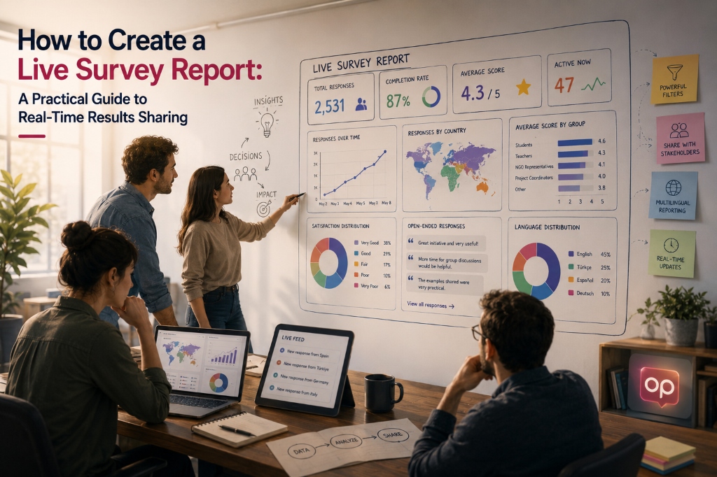
A live survey report is a reporting view that updates as survey responses are collected. Instead of showing only a raw data table, it presents results through charts, cards, feeds and filters.
A well-designed live report can show:
- total number of respondents,
- response distribution by question,
- percentages and frequencies,
- average scores,
- response trends over time,
- demographic breakdowns,
- results filtered by country, language or stakeholder group,
- open-ended response feeds,
- audio response transcripts,
- selected quotes,
- a shareable view for project partners or stakeholders.
In PublicOp, Live Report is created automatically in the background once responses start coming into a survey. Charts and numbers update in real time. Manual refresh is not required. The report can be viewed while the survey is active, and after the survey closes it remains available as a static report based on the collected results.
What is a live report for?
The main purpose of a live report is to make raw survey data visible earlier and in a more usable format.
In a traditional workflow, teams often move through this sequence:
Publish the survey
Collect responses
Download the data
Clean the data
Analyse the data
Create charts
Prepare a report
Share findings with stakeholders
A live report does not remove all of these steps. But it makes early monitoring and descriptive reporting much faster.
A more practical workflow can look like this:
Publish the survey
Monitor responses through Live Report
Filter by country, language or target group
Share early findings in a project meeting
Export raw data for deeper analysis
This is useful for:
- Erasmus+ needs assessments,
- NGO and foundation research,
- post-event feedback,
- customer and user feedback,
- multilingual stakeholder surveys,
- quick QuickPoll results,
- preliminary analysis in field research.
A live report does not do the researcher’s final analysis. It gives the researcher and stakeholders an earlier, clearer and more interactive view of the data.
A live report is not a formal academic analysis report
This boundary matters.
A live survey report can:
- visualise results,
- show percentages and frequencies,
- summarise average scores,
- display filtered segments,
- list open-ended responses,
- provide a shareable view for stakeholders.
But it does not automatically:
- write an academic findings section,
- run t-tests or ANOVA,
- calculate p-values or statistical significance,
- code open-ended responses into themes,
- run sentiment analysis,
- generate an official Erasmus+ or EU report format,
- guarantee that the data is representative or scientifically valid.
A live report is strong for descriptive analysis, monitoring and decision support. Formal interpretation, sample assessment, statistical testing and final research writing remain separate work.
Which question type needs which visualisation?
A good live report uses the right visualisation for each kind of question. Not every survey result should be shown in the same chart type.
Single choice questions
Single choice questions allow respondents to select one option.
Example:
How would you rate this event overall?

- Very poor
- Poor
- Fair
- Good
- Very good
Useful visualisations include:
- Bar chart,
- Pie chart,
- Doughnut chart.
A Bar chart is often the clearest way to compare categories. A Pie or Doughnut chart can work when there are only a few categories and the goal is to show overall distribution quickly.
In PublicOp, Single choice questions can be displayed in Live Report as Bar chart, Pie chart or Doughnut chart.
Multiple choice questions
Multiple choice questions allow respondents to select more than one option.
Example:
How did you hear about this project?

- Social media
- Email
- Website
- Friend or colleague
- Other
For this type of question, Pie charts can be misleading. The total number of selections may be higher than the number of respondents, so the “whole pie equals 100%” logic can become confusing.
A better view is usually:
- Bar chart,
- frequency by option,
- percentage by option.
In PublicOp, Multiple choice questions can be reported with a Bar chart showing how often each option was selected.
Dropdown questions
Dropdown questions behave much like Single choice questions. The respondent selects one option from a list.
Useful visualisations include:
- Bar chart,
- Pie chart,
- Doughnut chart.
Dropdowns are often useful when the response list is long. In reporting, they are still read as category distributions.
Likert and rating questions
Likert and rating questions measure agreement, satisfaction, intensity or evaluation.
Example:
This service met my needs.

- Strongly disagree
- Disagree
- Neither agree nor disagree
- Agree
- Strongly agree
Two pieces of information usually matter:
- the average score,
- the distribution of scores.
In PublicOp, Likert / rating questions can be shown using:
- Average Card,
- Bar chart,
- Gauge.
Average Card gives the overall score. Bar chart shows how responses are distributed across the scale. Gauge can be useful when the report needs to show proximity to a target or overall performance level.
Numeric input questions
Numeric input questions collect numbers.
Example:
How many times have you used this service in the past month?
Useful views include:
- Average Card,
- Number Card,
- total,
- average,
- summary indicators.
In PublicOp, Numeric input data can be shown through Average Card or Number Card.
Short text and long text questions
Open-ended text responses need a different reporting logic. They are less about charting a distribution and more about reading language, experience and explanation.
Useful views include:
- Text Feed,
- Word Cloud,
- Quotes.
Short text responses can be monitored through Text Feed or Word Cloud. Longer open-ended answers often work better as Text Feed or Quotes.
A Word Cloud can help with quick exploration, but it is not a substitute for qualitative analysis.
Audio response questions
Audio responses can be reported in two ways:
- playable audio for the original recording,
- transcript text for reading and review.
In PublicOp, responses collected with AudioRecorder can appear in the report as a playable audio player. Transcripts produced by Whisper or Speech-to-Text models can also be listed in a Text Feed.
Audio responses are not automatically summarised or thematically analysed. The report works with the raw audio and raw transcript.
Consent fields
Consent fields should usually be shown simply.
Useful views include:
- Yes / No distribution,
- Bar chart,
- Pie chart,
- Number Card for respondents who gave consent.
The purpose of consent is usually to manage participation and documentation, not to become a central finding. In many reports, consent data should be kept minimal.
How to choose the right chart
Chart choice should follow the data type, not personal preference.
A practical rule:
Category comparison:
Bar chart

Small number of categories:
Pie chart or Doughnut chart

Change over time:
Line chart

Average score:
Average Card

Single total or count:
Number Card

Likert / rating distribution:
Bar chart + Average Card

Open-ended responses:
Text Feed, Word Cloud or Quotes

Audio responses:
Playable Player + Transcript Text Feed
PublicOp supports Pie, Bar, Line and Doughnut charts. It can also show average, percentage, frequency and total participant indicators. Charts can be created from an automatic starting template, and users can change the chart type in Report Builder.
A good report is not the one with the most charts. A good report shows the right information in the clearest way.
What is Report Builder?
Report Builder is the design interface for Live Report. It lets users go beyond automatically generated charts and shape the report around the story they want to tell.
With Report Builder, users can:
- choose which survey questions appear in the report,
- change chart types,
- move question blocks,
- resize widgets,
- design the report layout freely,
- add titles,
- add explanatory text,
- add static text, images, video and dividers.
In PublicOp, Report Builder works with drag and drop. Blocks can be repositioned and resized. The “no auto-compact” approach preserves intentional empty space, which makes it easier to design a professional research dashboard or presentation-style report.
This matters because a good report is not just a collection of charts. It needs headings, short interpretation notes and a logical flow.
How should a live report be structured?
Putting every survey question into a report in the same order as the questionnaire is usually not the best approach. A stronger report follows the research purpose.
A practical structure could be:
1. Overall participation summary
2. Respondent profile
3. Key findings
4. Target group or country breakdowns
5. Satisfaction, need or impact indicators
6. Open-ended responses and quotes
7. Audio responses or field feedback
8. Preliminary interpretation and next steps
A live report may look like a dashboard, but it should still have a narrative structure. A stakeholder opening the report should quickly understand:
- how many people responded,
- who responded,
- what the main trend is,
- which groups differ,
- what open-ended responses suggest,
- what the results mean for the next decision.
Report Builder can be used to create this structure.
Segment analysis with Global Filter
Survey results are rarely just one overall number. Different groups may answer differently.
Useful breakdowns include:
- country,
- language,
- age group,
- gender,
- organisation type,
- stakeholder role,
- teacher / student / NGO representative,
- customer segment,
- event participant type.
Global Filter lets the report filter all widgets by selected answers.
For example:
Show only respondents from Türkiye.
Show only teachers.
Show only female respondents.
Show only responses submitted in English.
Show only female teachers from Türkiye.
In PublicOp, Global Filter can be added as a widget. Multiple filters are supported. When the filter changes, all widgets on the report page update immediately to show only the selected segment.
This is especially useful in stakeholder meetings. A team can begin with the overall results and then move into country, language or target group breakdowns.
Does Global Filter affect export?
This distinction should be clear. In PublicOp, Global Filter affects the report view. Export is handled from the main Data / Responses area, not from the Live Report interface.
In other words:
Global Filter = filters the report view.
Data Export = exports raw data from the main data area.
The exported data is raw response data, not a summary of the charts shown in the report. This is the right separation. Visual reporting and data analysis are related, but they are not the same task.
PublicOp supports CSV Export, Excel Export and SPSS Export. Codebook, Variable Labels, Value Labels and the LANGUAGE column can be preserved during export.
Live reporting for multilingual surveys
Multilingual survey reporting can quickly become fragmented. If every language version is created as a separate form, every language may generate a separate report. The team then has to merge results later.
PublicOp takes a different approach. Because it uses a single dataset structure, responses from different language versions are combined in the same data structure. A survey published in five languages produces one Live Report, not five separate reports.
This makes it possible to:
- monitor all responses in one report,
- combine answers to the same question under the same chart,
- filter by language,
- combine language filters with country or stakeholder filters,
- give project partners one shared report view.
PublicOp stores response language in the LANGUAGE column. This can be used in Global Filter.
For example:
Show only responses submitted in English.
Show only responses submitted in Turkish.
Show only responses submitted in German.
Open-ended responses, however, remain in the language used by the respondent. PublicOp does not automatically translate open-ended responses into a single report language. That is not currently supported. Multilingual qualitative analysis still requires human review.
How to report open-ended responses
Open-ended responses should be handled differently from numeric or categorical results. The purpose is often to see language, experience and reasoning rather than simple distribution.
In PublicOp, open-ended responses can be shown using:
- Text Feed,
- Word Cloud,
- Quotes.
Text Feed lists responses and helps researchers monitor new answers as they arrive.
Word Cloud highlights frequently used words. It can be useful for quick exploration, but it is not qualitative analysis.
Quotes can present selected or highlighted statements as quote cards. This is especially useful for NGO research, needs assessments, user experience studies and stakeholder reports.
The limitation is important: PublicOp does not automatically code open-ended responses into academic themes. It does not perform sentiment analysis and turn it into ready-made analysis variables. Open-ended responses are exported as raw strings through Data Export.
How to report audio responses
Audio responses can be powerful when the research needs lived experience, field feedback or participant stories.
In PublicOp, responses collected with AudioRecorder can appear in Live Report as:
- a playable audio player,
- transcript text,
- Text Feed entries.
This turns audio feedback into something that can be listened to, read and reviewed in the report.
On export:
- the audio file can appear as a cloud storage URL,
- the transcript can be included in the data table as a string.
Audio responses are not automatically summarised. They remain raw transcripts. Researchers need to read and interpret them.
When to use a Shareable Report Link
One of the strongest uses of a live report is sharing results with stakeholders.
In PublicOp, a Shareable Report Link can be created for Live Report. This is useful for:
- showing results to project partners,
- sharing a report in an internal team meeting,
- giving donors or supporters access to selected early findings,
- sharing post-event satisfaction results with organisers,
- sharing QuickPoll results on social channels,
- giving multilingual project partners one shared report view.
But the sharing model has clear limits.
In PublicOp:
- Live Report can be shared through a public link,
- anyone with the link can view the report,
- iframe / embed is not supported,
- password-protected or role-based report access is not supported,
- personal data is not automatically hidden.
Before creating a public link, researchers should review which widgets are included in the report.
Privacy and personal data risks in live reports
Live report sharing is powerful, but it requires care. Public reports can create personal data or sensitive data risks.
Risky fields include:
- names,
- email addresses or phone numbers,
- identifying details in open-ended responses,
- small demographic segments,
- sensitive personal experiences,
- audio responses that may identify the speaker,
- combinations of organisation, city, role and personal story.
PublicOp does not automatically redact personal information from open-ended responses. Names, phone numbers, emails or sensitive details inside short text or long text responses are not automatically anonymised. Before creating a public Shareable Report Link, the researcher is responsible for checking what appears in the report.
A practical rule:
Be careful before showing Text Feed, Quotes or Audio widgets in a public report.
If you do not want personal data to appear, do not add the relevant question as a Chart, Text Feed, Quotes or Audio widget. Build the public report mainly around aggregated charts and anonymous summary indicators.
Do not ignore small sample risks
Even if a report does not show names directly, small segments can still create re-identification risk.
For example:
Country: Germany
Organisation type: Small NGO
Role: Project coordinator
Gender: Female
Open-ended response: personal experience narrative
This combination may make someone indirectly identifiable.
Before sharing a live report, ask:
- Will this report be public?
- Is the sample size small?
- Could filters make individuals identifiable?
- Do open-ended responses contain sensitive details?
- Could audio responses identify a person?
- Will everyone see this report, or only project partners?
PublicOp makes report sharing easier. It does not automatically remove privacy risk.
Live Report and Data Export are different
Live Report and export are related, but they are not the same thing.
Live Report:
- visualises results,
- presents charts and widgets,
- can be shared through a link,
- updates in real time,
- supports interactive breakdowns through Global Filter.
Data Export:
- exports raw data,
- supports CSV, Excel and SPSS formats,
- supports deeper analysis,
- can preserve Variable Labels, Value Labels, Codebook and the LANGUAGE column in SPSS Export.
In PublicOp, export is handled from the main Data / Responses area, not from the Live Report interface. Exported data is raw response data, not the visual summary shown in the report.
PDF Export and chart download as PNG or JPG are not supported. If a formal final report is needed, the researcher should use exported data and report insights to prepare a separate document.
Live reporting for Erasmus+ needs assessment
Erasmus+ needs assessments often involve stakeholders from several countries. A live report can become a useful collaboration tool.
Example workflow:
Partners in Türkiye, Spain, Italy and Germany share the same needs assessment survey in their own languages.
Responses are combined into one dataset.
Live Report shows all results in one place.
Global Filter separates results by country.
Project partners discuss country-level differences in a transnational project meeting.
This can strengthen a project idea before application. The team is not only working from assumptions; it can discuss early evidence.
However, Live Report does not automatically write the Erasmus+ application text. It provides data and early findings. The project team still writes the final project rationale and narrative.
Live reporting for NGO and foundation research
For NGOs and foundations, transparency often matters. Some early findings may need to be shared with the public, donors, board members or partner organisations.
A live report can help when used carefully.
Example:
The research team creates a report with only aggregated charts.
Sensitive open-ended responses are not added.
A Shareable Report Link is shared internally or publicly.
Stakeholders can see the overall direction of the findings.
This can speed up communication. But personal data and sensitive responses should be kept out of public reports unless there is a clear and ethical reason to include them.
Live reporting for post-event feedback
Speed matters in post-event feedback. Organisers often need results on the same day, not weeks later.
With PublicOp, a short event feedback survey can be created using QuickPoll. A QR code or link can be shared with participants. As responses arrive, Live Report updates.
Useful report elements include:
- total number of responses,
- overall satisfaction average,
- speaker rating,
- organisation rating,
- intention to attend again,
- open-ended suggestions,
- Gauge for overall satisfaction.
Average Card and Gauge are especially useful for quick monitoring in this scenario.
Live reporting for customer and user feedback
For product and service teams, live reporting can make user feedback visible across the organisation.
Example workflow:
A short user survey is launched after a new feature release.
Responses are monitored in Live Report.
Global Filter compares new users and returning users.
Open-ended feedback is followed through Text Feed.
Raw data is exported to Excel or SPSS for deeper analysis.
This keeps feedback from staying only with the data team. Product, marketing and management teams can all work from the same live view.
Comparing countries and languages in multilingual stakeholder surveys
In multilingual projects, fragmented data is a common problem. If every country runs its own form, results later need to be merged manually.
PublicOp’s single dataset approach means:
- responses from different languages are combined,
- Live Report works as one report,
- Global Filter can show language and country breakdowns,
- the same question can be aggregated under the same chart across languages.
This is useful for European projects, international NGO work and multi-country consulting research.
Steps to create a live survey report
A practical live survey report can be created through these steps.
1. Clarify the purpose of the report
Start by deciding what the report is for:
Stakeholder briefing?
Project meeting?
Public early findings?
Internal decision support?
Post-event evaluation?
If the purpose is not clear, the report will become a cluttered dashboard.
2. Choose which questions to include
Not every survey question needs to appear in the report. Questions containing personal data, operational checks or sensitive open-ended responses may be excluded.
Use Report Builder to include only the questions that are useful for the intended audience.
3. Choose the right chart for each question
Use Bar or Pie for Single choice, Bar for Multiple choice, Average Card and distribution for Likert, Text Feed or Quotes for open-ended responses.
The chart should match the data type.
4. Show participation context at the top
At the beginning of the report, include context such as:
- total number of respondents,
- number of responses,
- language or country distribution,
- basic respondent profile.
This helps viewers interpret the rest of the report.
5. Add Global Filter
If the survey collects responses from different groups, Global Filter is valuable.
Useful filters include:
Country
Language
Stakeholder role
Organisation type
Age group
Gender
These filters let stakeholders explore the report from their own perspective.
6. Use open-ended responses carefully
Open-ended responses can add depth, but they can also create privacy risk. Think carefully before showing sensitive text in a public report.
7. Run a privacy check before sharing
Before creating a Shareable Report Link, check:
Does the report show names?
Do open-ended responses contain personal information?
Can audio responses identify someone?
Could small segments make individuals identifiable?
Are only appropriate widgets included?
8. Use Data Export for deeper analysis
Live Report is for monitoring, early insight sharing and decision support. For deeper analysis, export the raw data as CSV, Excel or SPSS.
Common mistakes in live survey reporting
Avoid these mistakes:
- adding every question to the report without review,
- showing personal data in a public report link,
- sharing small segments without considering re-identification risk,
- overusing Pie charts,
- treating a Word Cloud as qualitative analysis,
- presenting Live Report as a formal academic findings report,
- implying statistical significance without testing,
- implying automatic thematic analysis,
- confusing export with the report view,
- sharing a report link as if it had role-based access control,
- planning around PDF Export or embed when they are not supported.
Live reporting is powerful when its boundaries are understood.
How PublicOp fits into this workflow
PublicOp is not an AI system that automatically writes academic reports from survey data. It does not interpret results on behalf of the researcher. It does not run statistical significance tests and produce final scientific conclusions.
A more accurate positioning is:
PublicOp is a research operations platform that helps teams create surveys, collect responses, monitor results through live and filterable reports, share findings with stakeholders and export clean raw data for deeper analysis.
Relevant PublicOp features include:
- Live Report for real-time results,
- Report Builder for flexible report layout,
- Global Filter for segment analysis,
- Shareable Report Link for stakeholder sharing,
- QuickPoll for fast feedback,
- Advanced Polls for structured surveys,
- SurveyTemplate and Localize Survey for multilingual structure,
- Branching / Skip Logic for targeted question flows,
- AudioRecorder for audio responses,
- Data Export, CSV Export, Excel Export and SPSS Export,
- Variable Labels, Value Labels, Codebook and LANGUAGE column support,
- single dataset logic for keeping multilingual data in one structure.
These features reduce operational work. They do not remove the need for research design, data interpretation, ethical review or final reporting.
Conclusion
A live survey report turns survey results from a static data table into a visible, shareable and filterable decision-support view.
A good live report:
- is designed around the research purpose,
- shows only relevant questions,
- uses the right chart types,
- gives respondent context,
- supports segment analysis with Global Filter,
- combines multilingual data in one report,
- handles open-ended and audio responses carefully,
- checks privacy before sharing,
- works alongside Data Export for deeper analysis,
- is used as a decision-support and early insight tool, not as a substitute for formal analysis.
The value of a live report is not that it interprets results automatically. Its value is that it makes the research process more visible, faster, more transparent and easier to discuss.